


TL;DR
AI is no longer a strong differentiator on its own. As more companies use the same technology, founders need to stop selling the “WOW” of AI and focus on the “HOW”: how their product solves real customer problems, reduces risk, and builds trust.
This approach – dark mode, gradients, robots, futuristic visuals can create sameness and can increase CAC, weaken memorability, and hurt enterprise credibility. Strong B2B brands should treat AI as a tool, not the message. The real advantage comes from clear positioning, trusted visual communication, and a brand that shows customers you understand their business and know how to help them.
A lot of companies building AI-driven products or process automation assume that this is their main differentiator. But that's a mistake. When everyone has it, the buzzword loses its magic. In an AI-driven business world that sold almost exclusively through product demos and cold emails, it suddenly turns out that technology is no longer the bottleneck. The bottleneck becomes who occupies a place in the customer's mind first and HOW they help.
Imagine a company automating accounting processes. If their website basically just yells "We have AI!", it sounds like a crush on trendy tech, not a promise of a real solution. Just like the construction industry realized they don't need a hammer in every logo – today's brands need to remember that AI is a tool, not the end goal. It's just a hammer. Instead of chasing tech-driven hype, brands need a complete overhaul of their visual communication. It's time for a strategic pivot from the "WOW" effect to the "HOW" effect.
The sea of sameness, or the trap of visual debt
Many fresh startups, instead of finding their unique voice, follow the well-trodden path of visual clichés: dark mode, purple-blue gradients, robot icons, levitating cubes, and futuristic fonts. At first glance, it looks modern. In practice, brands just blend into one unrecognizable blob.
For company decision-makers, this carries real business consequences:
For the CMO: When you look exactly like dozens of other AI startups, clients won't remember you. This drastically spikes your customer acquisition cost (CAC) because you burn through more ad budget just to cut through the noise.
For the Technical Founder: Generic, flashy branding is basically "visual technical debt." Easy and cheap at first, but when the company grows and tries to enter the Enterprise market, this "startup-y" vibe will start blocking major deals and force an expensive rebranding.
Brands that chose a different path
The best brands prove you can stand out without flexing futuristic aesthetics. Look at Anthropic or OpenAI – you won't find them screaming "we have AI!" Even Claude's recent "The AI for problem solvers" campaign puts the weight heavily on the HOW, not the WOW.
First up is Cohere. Instead of cold, digital motifs, they drew inspiration from biology – cellular forms and organic structures. It shows their neural networks are adaptable, making the product feel human, approachable, and rooted in real needs.


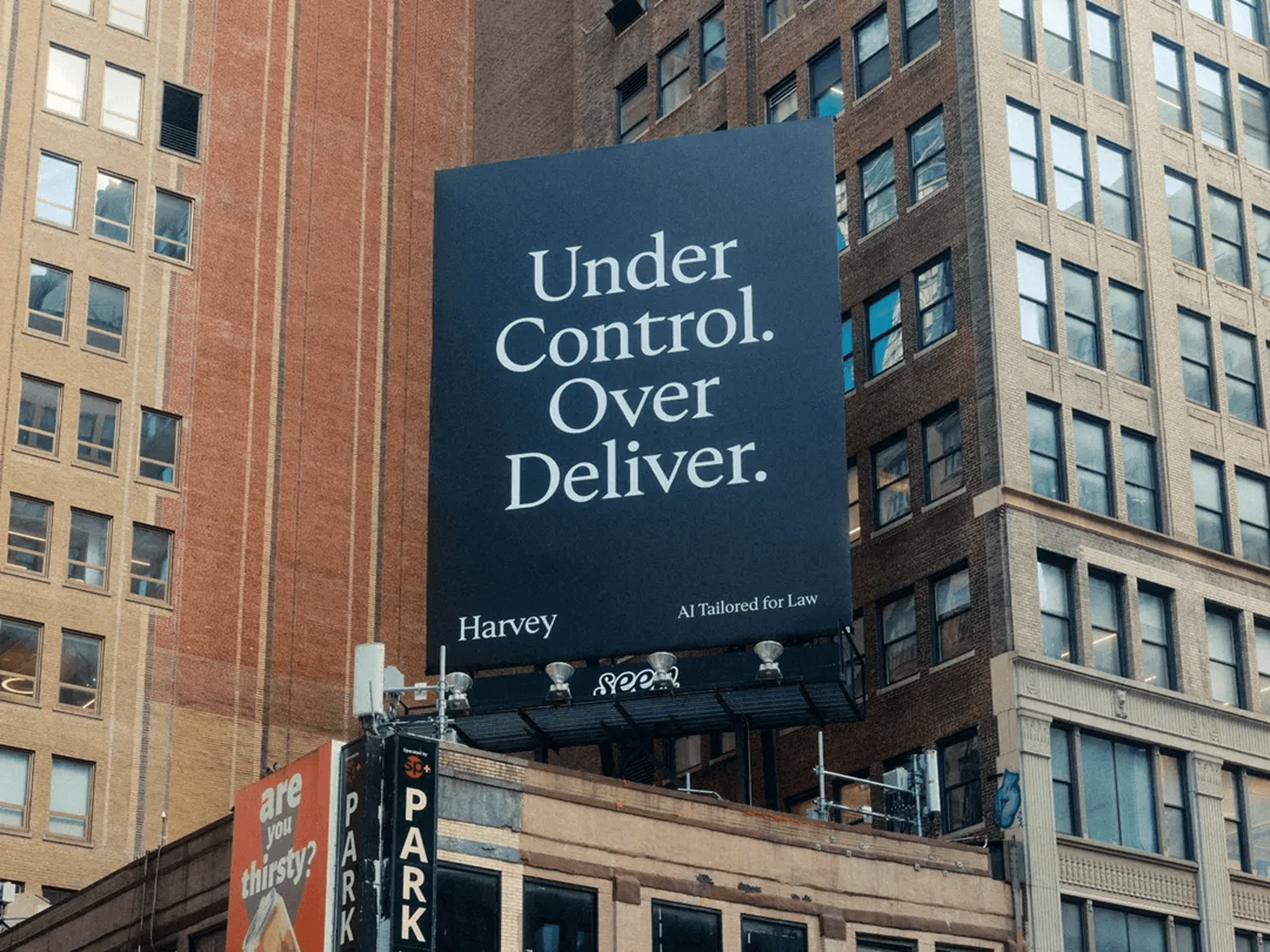
The second example is Harvey, an AI platform for the legal industry. Their visual identity is subdued, classic, and minimalist – because lawyers treat tradition, discretion, and seriousness as sacred. A neon logo with a bright gradient would instantly disqualify them in the eyes of major law firm partners. Their branding conveys stability on par with a top-tier financial institution.

The "half" I mentioned – Harvey's competitor Legora – just dropped a new spot featuring Jude Law. Also, an AI tool for lawyers, but they leaned into the tried-and-true method of emotional brand-building. Their claim: "Law just got more attractive." No AI, no hammer, just their beautifully presented service.
From "WOW" to "HOW": Mitigating risk in B2B
Visual identity is way more than aesthetics – it's a strategic tool for risk management and value communication. This is where founders need the mindset shift: from chasing "WOW" to designing for "HOW."
Trust is built on the "HOW" effect. When the client sees how the tool will optimize their workflow, the technology fades into the background. A well-designed color palette, thoughtful information architecture, and stable typography signal to the decision-maker: "We know how to do this. We understand your business, we deliver, and we're not going to disappear in a year." Smart branding doesn't prove you have a hammer – it convinces the client you know HOW to use it safely to build their house.
Technology isn't the bottleneck anymore – it's becoming standard. What will set you apart is your brand and the values you stand for.
Quick audit
Before your team orders a new visual identity, ask yourselves:
If we cover up our logo and remove "AI" from our website, does the client still know what unique value we provide?
Does our image ease the anxiety of a corporate decision-maker, or amplify it?
Will our visual identity survive the next 3–5 years, when AI is no longer an innovative
By combining my experience working with B2B tech brands with the studio’s experience in this space, we noticed a powerful opportunity for AI brands to build a strong market position through intentional design and proper storytelling.
Instead of creating yet another generic wrapper for AI, we help brands build trust, lower acquisition costs, and win Enterprise contracts. If you want to build a brand rooted in the "HOW" strategy that actually supports your business goals – we are here.
Together, we'll build an image that not only works but, above all, is trusted.